Project Brief
Worked with product managers at AIR to increase adoption of our geospatial analytics module in our flagship software platform. The result was a redesigned interface that eliminated technical barriers and reduced cognitive load on our users, while creating a new paradigm for future analytics workflows.
My Role
User Research, UX/UI Design, Visual Design and Usability Testing.
The Challenge
We knew that our clients needed to get a complete picture of catastrophic risk for the properties they were insuring, and geospatial analytics are a key part of that process. We also knew that our clients were impressed by the sophistication of the analytical tools we were offering. What we didn't understand was:
- Why were some clients who needed geospatial analytics not licensing our software
- Why were clients licensing the geospatial module but not making it a part of their company's risk analytics process
User Interviews
We interviewed several clients across market segments (insurers, reinsurers and brokers) and identified key user needs:
Working with volume
Our clients were performing geospatial analytics on thousands of individual locations a year. This meant that they couldn't afford to be slowed down by the software they were using. Beyond this, the interface for the geospatial module felt overwhelming to use unless they had received training from us on how to use it. As one client put it, their first reaction to our product was “I don’t have time [to learn] this”.
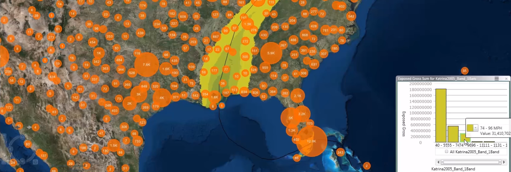
Maps and Visual Aids
Seeing those locations on a map was essential when validating things like flood risk (e.g. visualizing flood plains and measuring the distance from that location). The fact that our geospatial module only provided a map view of risk post-analysis introduced process overhead if our users made a mistake, as they would only find out after the analysis was completed.
Applying what we learned
Based on our user interviews we came up with some key concepts for our new design:
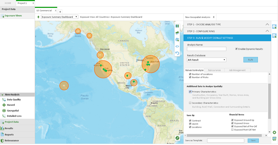
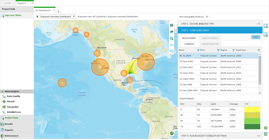
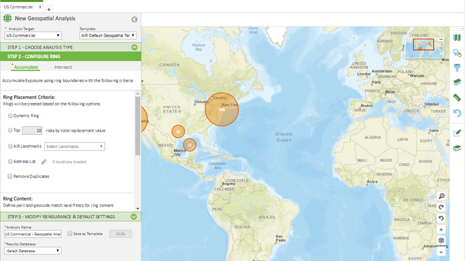
1. Provide context and a sense of direction
The interface should guide the user through the analysis set-up process and imply a sense of direction.
2. Use progressive disclosure to streamline choices
Although there were five different workflows the user could choose from, we should only show the options that were relevant to the one the user wished to run.
3. Provide visual feedback on user choices
Feedback on a map as the user is setting up their analysis so they can understand how the choices they make impact the locations they are analyzing.
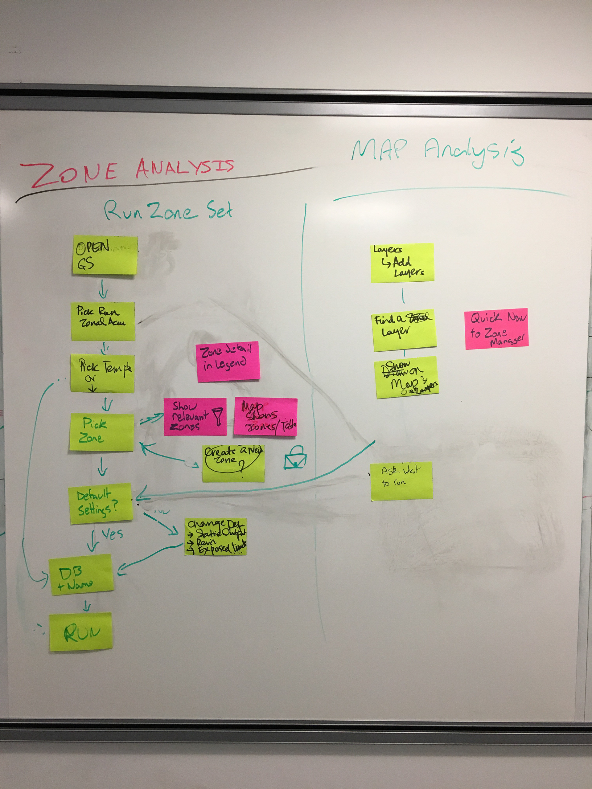
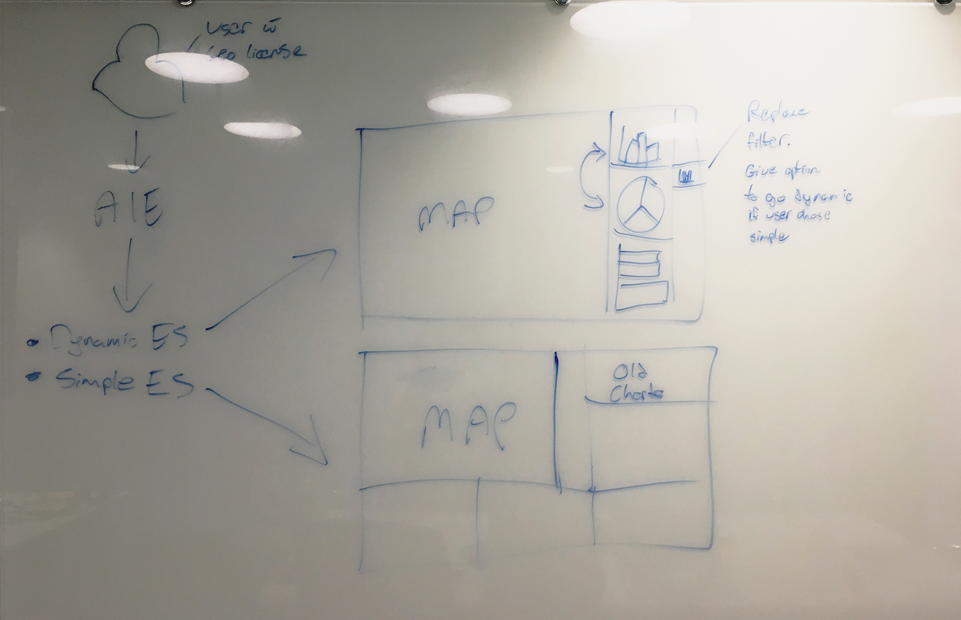
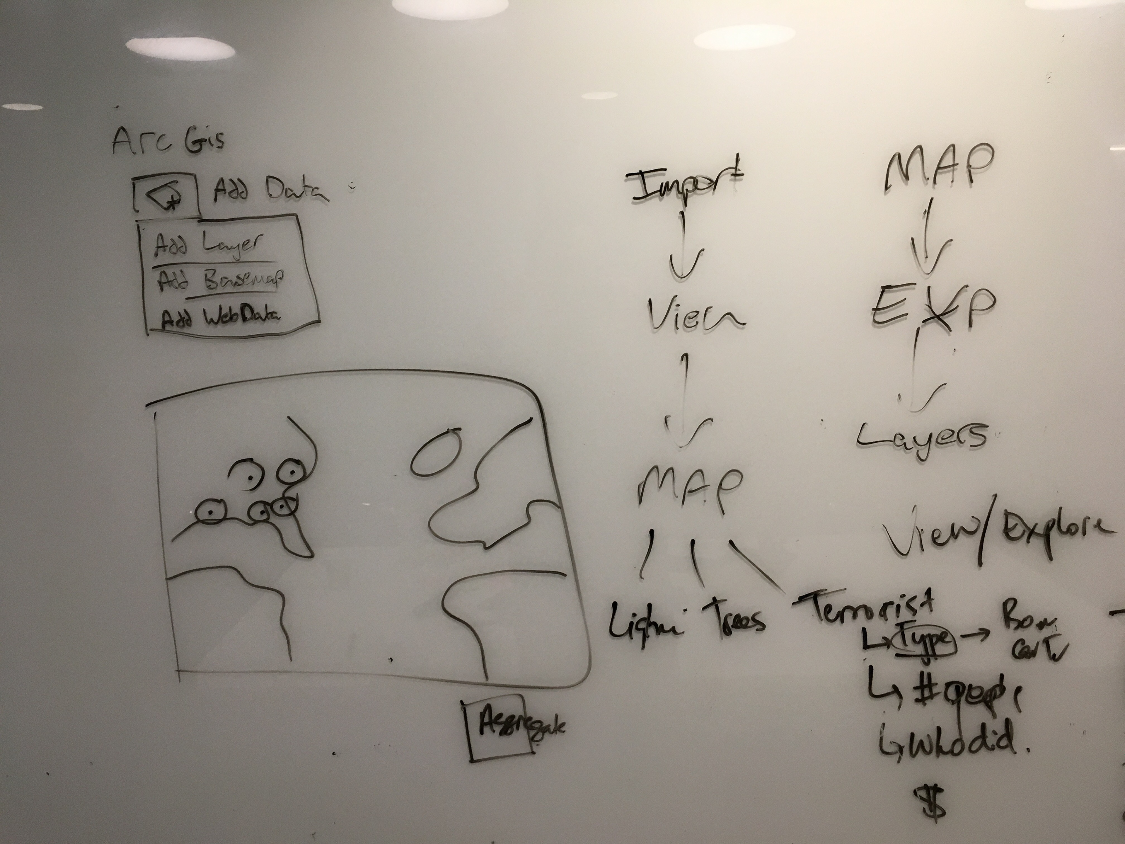
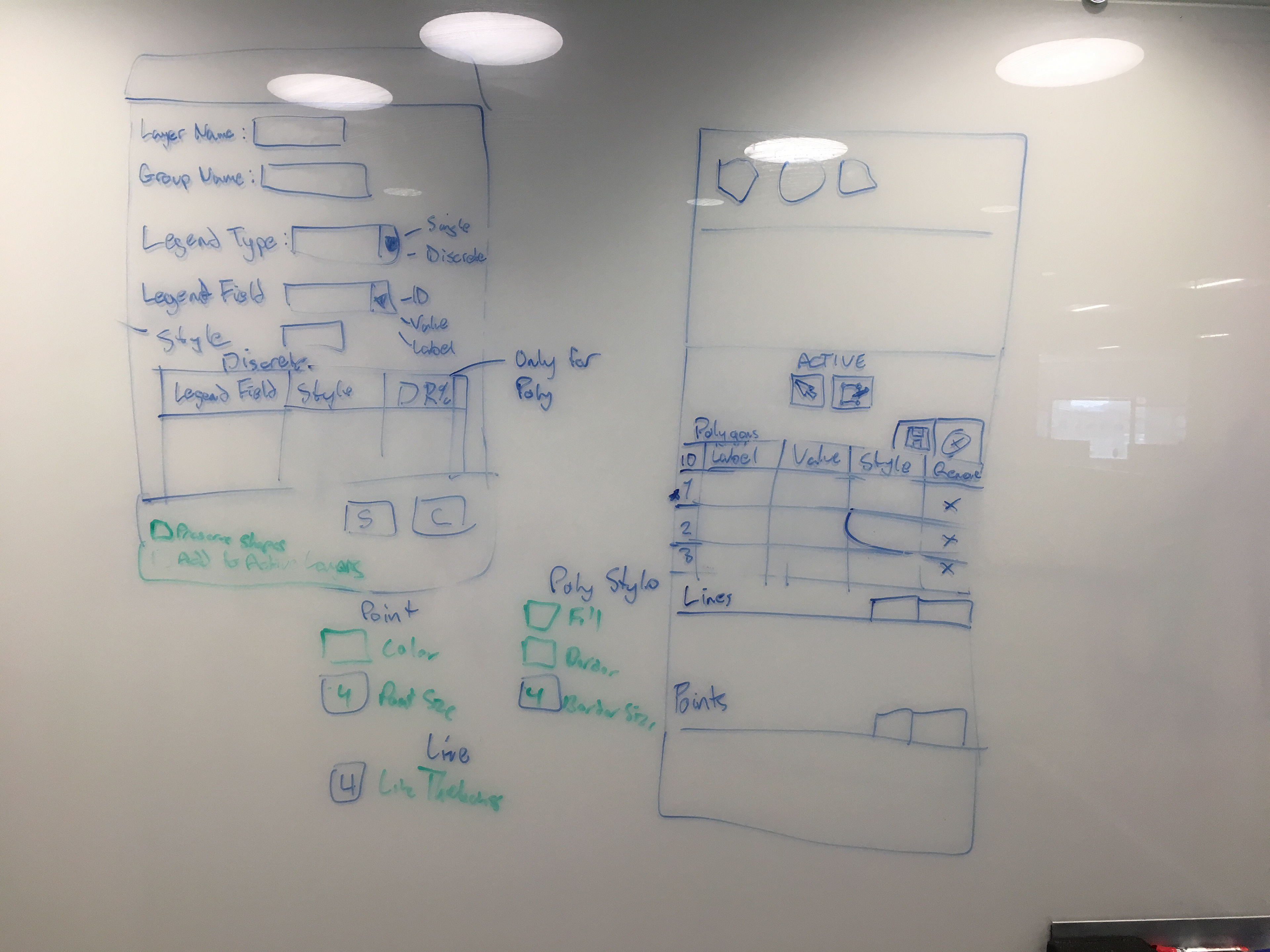
Sketching and Iterating on Design
Usability Testing
We conducted two rounds of usability tests on two drafts of the design and we got some key feedback that informed the final design:
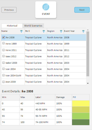
Some of the terminology we used (event analysis, ring analysis, use to accumulate) was confusing to users and some screens lacked descriptive text.
Difference between map layers for visualization and layers in an analysis was not clear to all users. We needed to make sure users understood when they were exploring and when they were setting up the analysis.
The Finished Product
Client Feedback
"That was really quick and straightforward. For me that's helpful..“
"The fact that the analysis is walking you through step by step as you see on the map is really helpful"
"Going through the steps gives you more confidence that you are making decisions and they are being saved“
"The maps are super quick so we can see where their locations are for running the analysis"
"The flow and format of the UI is great and a lot easier to use"