Project Brief
Addressing customer feedback that the core analytics product had become more difficult to use as it had increased in complexity over time. The resulting solution was an improved interface that better aligned with the thought processes of customers when analyzing natural catastrophes.
My Role
Design thinking facilitation, Principal Interaction Designer, Visual Design and Usability Testing
The Challenge
Running loss analytics to calculate the financial impact of natural catastrophes is a fundamental step in allowing insurance companies to manage their risk portfolios. While AIR’s software platform is considered best in class, our clients had told us they found it difficult to use without receiving hands-on training.
In addition, we noticed that more and more clients were moving away from the UI entirely in favor of custom API solutions.
Identifying the right problems
I facilitated two ideation sessions with internal stakeholders to get ensure we had consensus on what problems needed to be solved first.
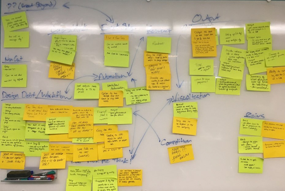
From this we identified two key themes for improvement:
1. Address existing workflow/design debt
The interface had been added to over six releases by multiple scrum teams, which was leading to a growing number of usability issues in an interface that was increasing in complexity over time.
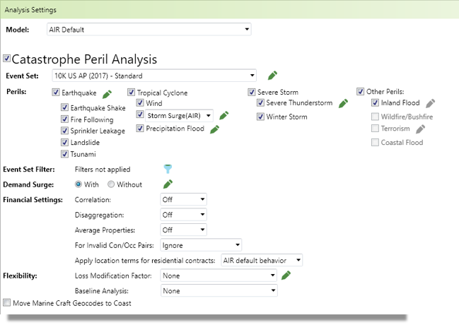
First page of loss analytics workflow. Multiple layout issues, confusing labels, too many types of controls, and unexpected behaviors when options were chosen.
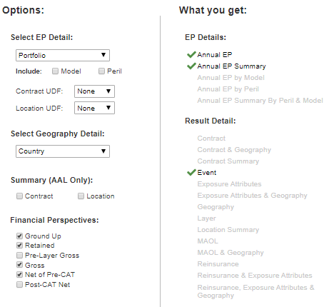
2. Make analysis output more straightforward
Clients had told us that because the interface was so sophisticated, they were sometimes unsure what output they'd get from their analysis based on the options they've chosen.
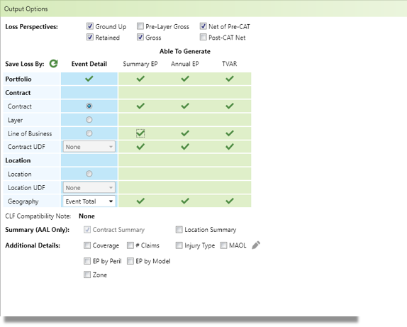
The current interface for analysis output: laden with jargon and unclear correlations between radio buttons in the grid and checkboxes above and below.
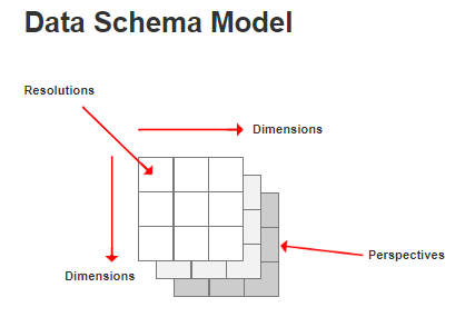
Design Exploration
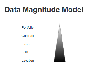
Before trying to come up with a new design, I wanted to first come up with a few conceptual models that could be used as a thought framework for approaching the redesign.
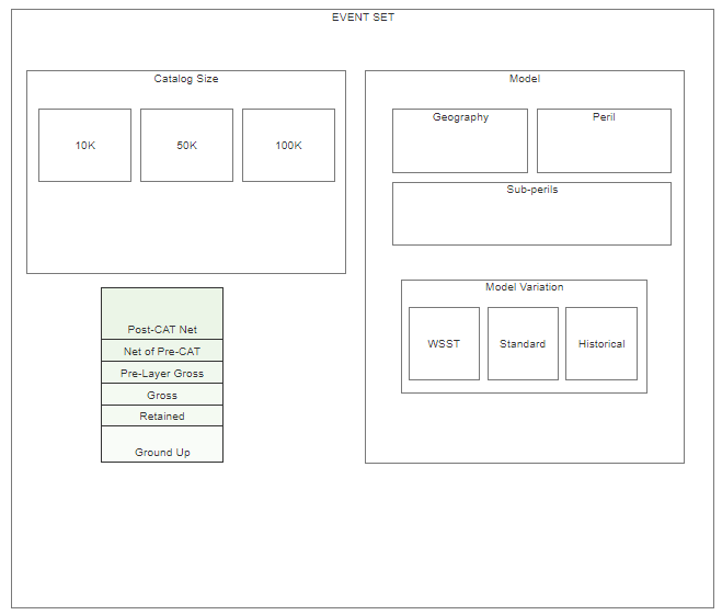
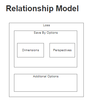
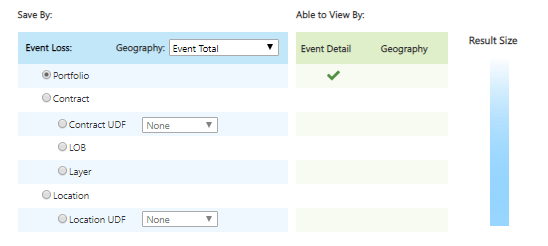
Once I'd established these conceptual models, a colleague and I proceeded to apply these models in various ways to the first draft of an updated interface:
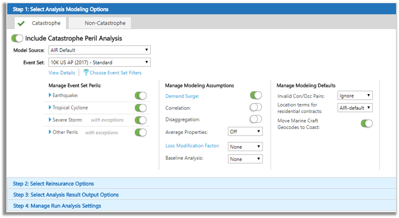
We simplified the types of controls being used on the screen, and grouped options that were related together.
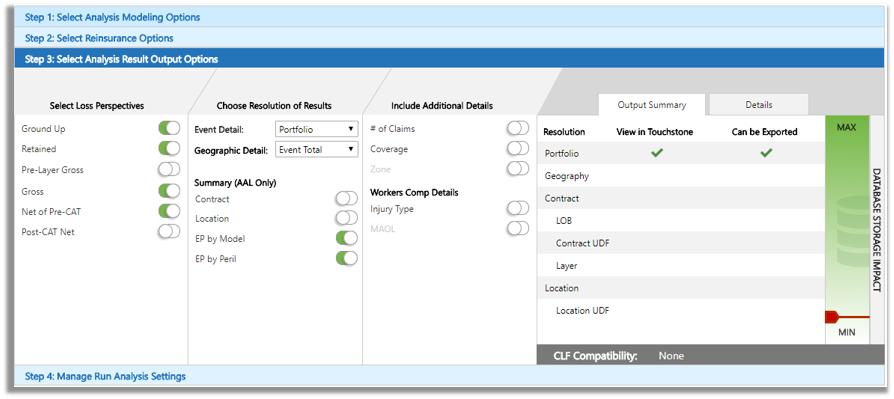
We introduced a database storage impact scale on the output screen to give clients feedback on the storage size of their loss results. This had come up as an issue for some clients who ran into issues managing their database resources in shared environments.
We also introduced a "Details" tab that told them specifically what result database tables would be generated by their analysis.
Testing a new design
We identified a number of clients who were daily users of this interface and I conducted moderated usability testing of the new design with them.
The feedback we received was extremely valuable, and some of it challenged our initial assumptions going into this project.
While clients appreciated that we had done a good job redesigning the existing options, the options they were given still seemed like they were adapting how they worked to the system. They wanted more flexibility over the region and peril specific models they were running and the fact that they had to choose an Event Set was too restricting.
While they thought that the database storage impact was helpful, knowing how big it would be wouldn't fundamentally alter what they needed to do. They found the list of result databases a much more helpful check-point that they had chosen the right options.
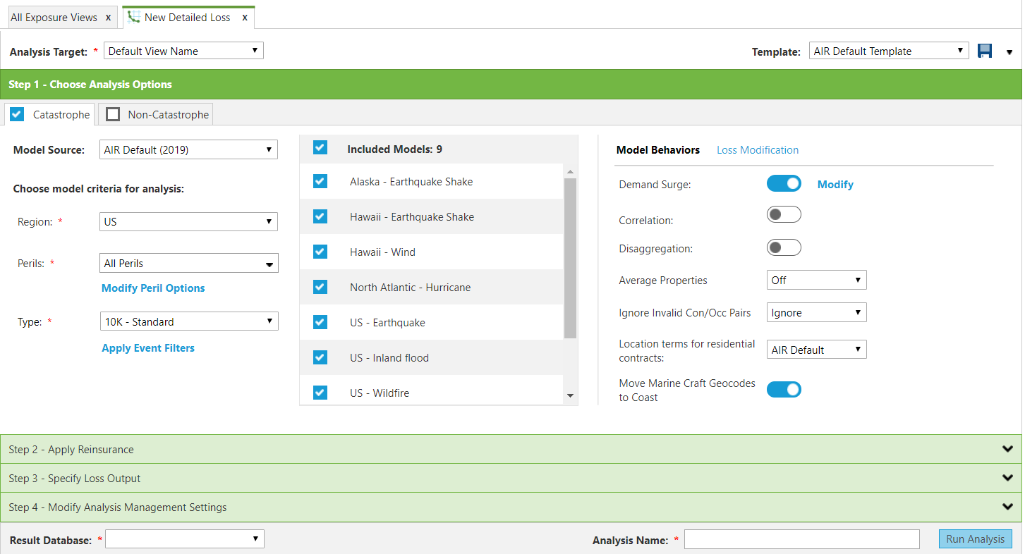
The Final Design

We simplified the options further by breaking apart the event set into three parts that act like a filter: Region, Peril and Type. This gave the user a shopping-cart of included region/peril models which they could check/uncheck to have more flexibility over their analysis results.
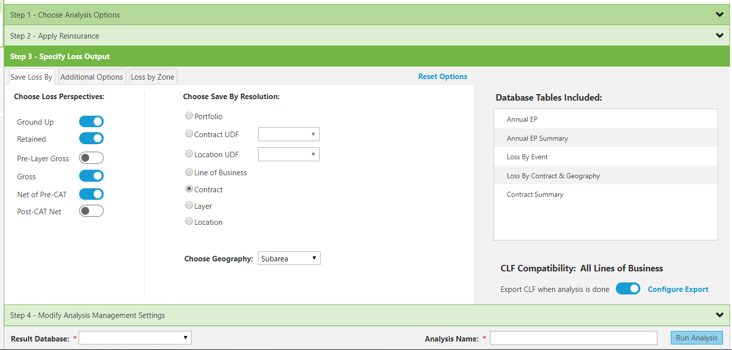
We did away with the storage size indicator and just gave users a simple list of database tables that would be included based on their Choices.