Project Brief
Led an effort to define, document and socialize a set of UX patterns for data filtering across the SecurityScorecard platform to improve consistency and accelerate product development.
My Role
Lead Designer
Design Consistency
If you're working with an existing Design System, or are looking to build a new one you may already be familiar with the concept of a UX Pattern. For folks who are new to the concept, it's worth taking a step back and explaining the importance of design consistency for digital products.
Reusable Components
Design systems are all about creating reusable components which follow clear guidelines, helping teams build new products quickly while ensuring that micro-interactions are consistent across a suite of products.
Removing Design Debt
Product teams working in parallel often produce concurrent solutions to similar design problems, which inevitably leads to inconsistencies in product experiences for your users. Documenting consistent design standards can help teams align on a single standard and make it easy to replace those concurrent solutions with an agreed-on standard.
Collaboration and Documentation
As digital products evolve so do the guidelines underpinning the components they are built with. By documenting and socializing reusable solutions with product teams, its' an opportunity to and capture our common understanding of them to improve overall quality.
So... What is a Design Pattern?
What it is
• Reusable solutions to a common design problems
• Promotes product consistency through communicating guidelines and best practices
• Collaborative in nature, evolving as our products grow and teams contribute new use cases
• Promotes product consistency through communicating guidelines and best practices
• Collaborative in nature, evolving as our products grow and teams contribute new use cases
What it isn't
• The answer to every design problem
• An overly prescriptive mandate
• Something only the design team can contribute to
• An overly prescriptive mandate
• Something only the design team can contribute to
Three Design Principles for Data Filtering
Before talking about the filter patterns themselves, I felt it was important to establish some design principles to help align teams who will be using these patterns to build products.
#1 Consider User Context and Intent
Where is the user in their Jobs To Be Done? Are they exploring options across a large data set before making a decision? (e.g. Using the time range filter on the History page to select different date ranges and observe how the grade on a scorecard has changed over time). Or are they trying to narrow down a data set to complete a specific task? (e.g. Filtering the list of IP addresses by Location on the Digital Footprint page to remove incorrectly attributed ones.)
It’s good to have a clear idea of what the user behavior is or should be when considering a filter pattern to implement
#2 Communicate a clear information hierarchy
Filters should make it clear what elements they control, through proximity to elements and placement on the page.
The user should immediately be able to tell what the parent/child relationship is between filter controls, and what the filter is actually being applied to. This can be made clear by following a left-to-right or top-to-bottom orientation of elements.
#3 Minimize Interaction Cost
Which filter pattern will require the fewest number of steps to get the user their desired result?
In general, users want to feel efficient and empowered as they move through the platform. Breaking options into smaller sets, and having good default options will reduce the amount of time it takes users to reach their goals.
In some circumstances it’s not possible and might even hurt the experience to oversimplify filter options, so it’s always important to keep in mind the user’s context and intent.
Now, let's talk about the patterns
After conducting an extensive audit of every screen in the Security Scorecard platform, and reviewing other UX best practices across the web, we arrived at the following four patterns for data filtering.
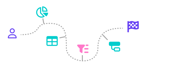
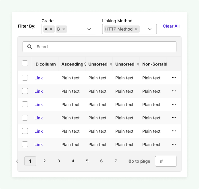
Pattern #1: Component Filter
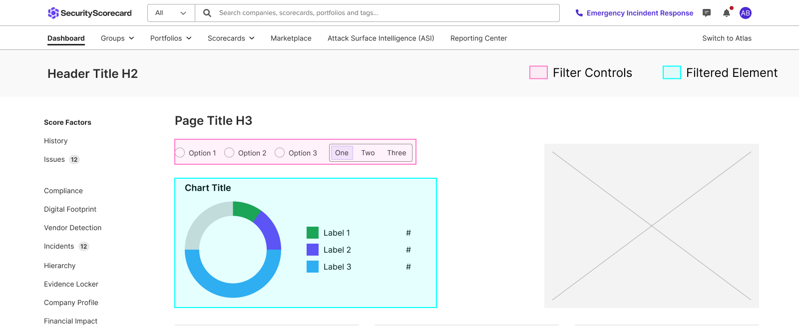
Scope
A single page element or component is being filtered (e.g. a single chart on a dashboard)
Scale
There is a small, fixed set of filter options the user can choose from
Layout
Filters are closely tied to the element it is filtering.
Behavior
The user is exploring differences between data points
Guidelines for Component Filters
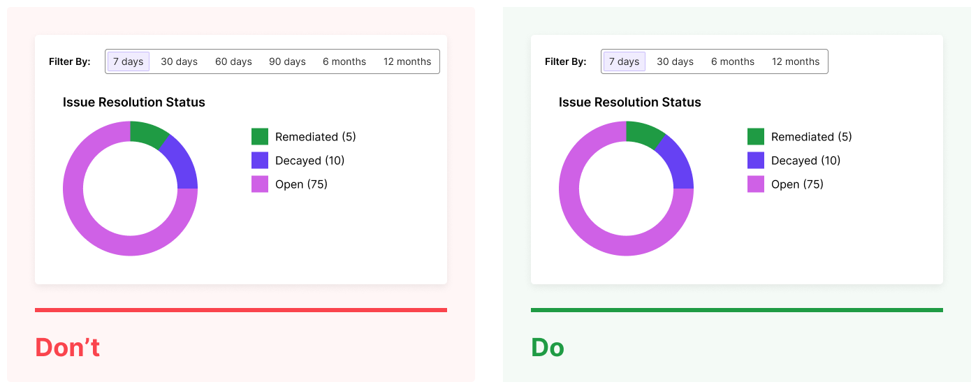
Don't
Give too many filter options, as the number of choices the user has to make slows down decision making and exploration.
Do
Give a smaller set of the most valuable or commonly used filter options to enable quick interaction.
Avoid
Exposing long lists of filter options in select controls, as this adds to interaction cost. Try to provide a smaller set of options that are the most relevant to your user and use case (where possible).
Do
Break filter categories down into smaller sets of options, and provide a Clear All button to quickly remove options across filter categories.
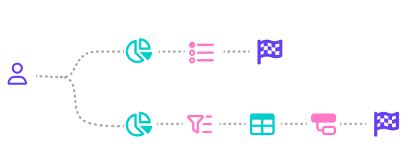
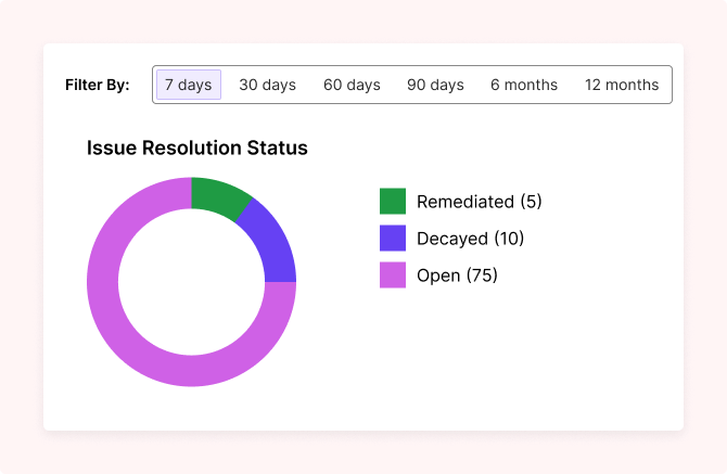
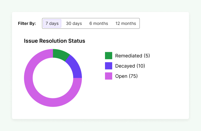
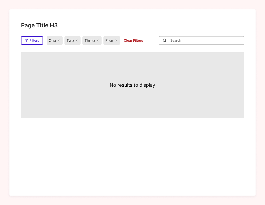
Pattern #2: Horizontal Filter Bar
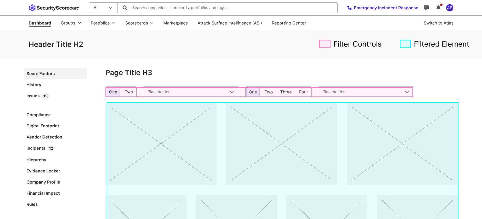
Scope
Can impact an entire page or a single page element (e.g. a dashboard or full-page table)
Scale
There is a limited set of fixed filter options the user can choose from
Layout
The filtered elements or page content are the primary area of focus, not the filters themselves
Behavior
The user is trying to narrow down a specific data point to complete a task
Guidelines for Horizontal Filter Bars
Don't
Show multiple lines of filter options, as this will take away screen real-estate from page content being filtered. If you have more than 4 filter controls you should use the Filter Drawer pattern instead.
Do
Keep filters to a single line above the filtered content
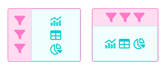
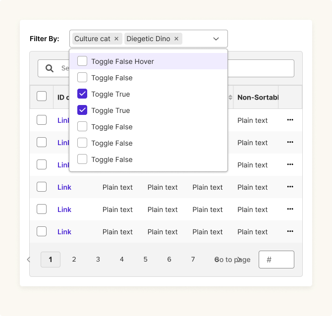
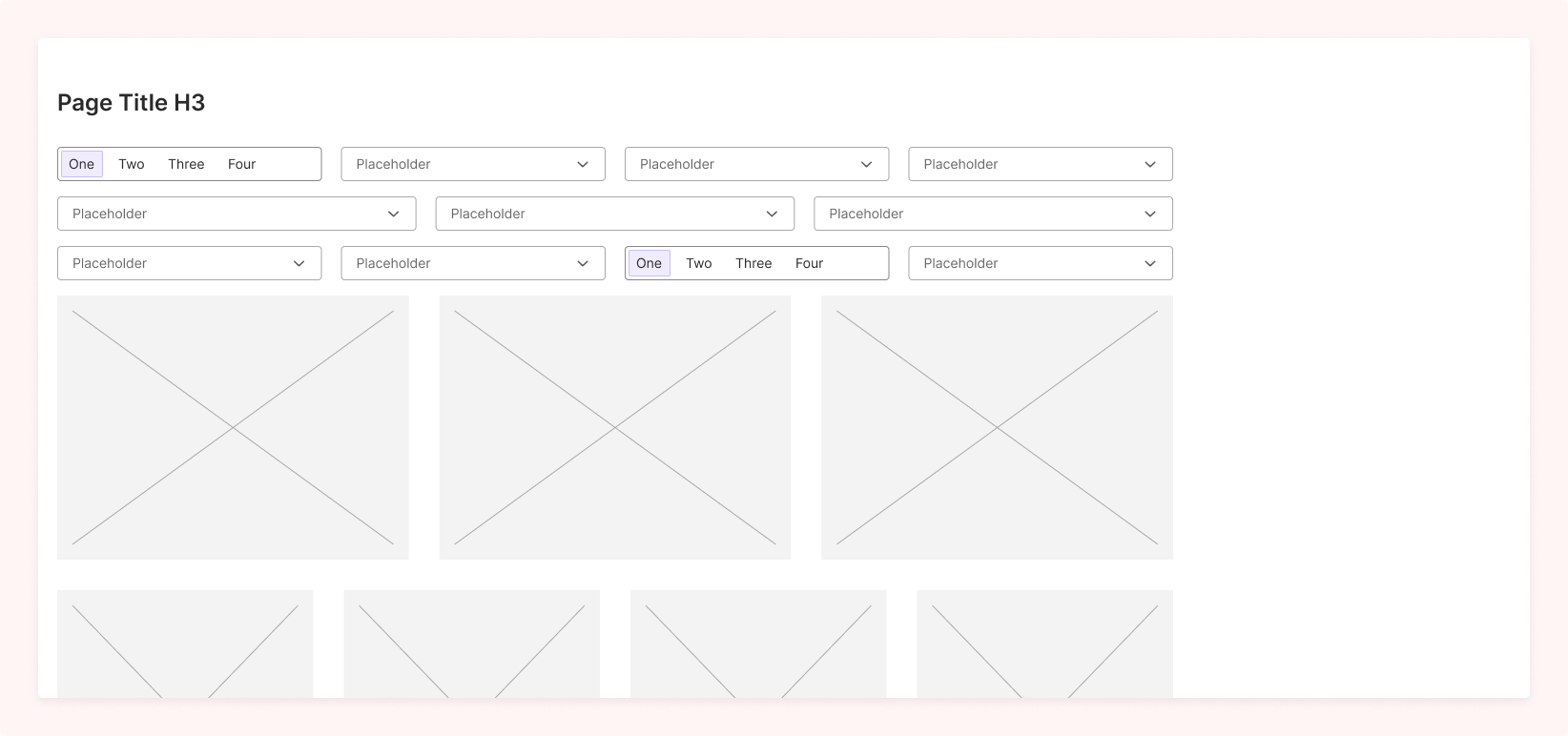
Pattern #3: Filter Drawer
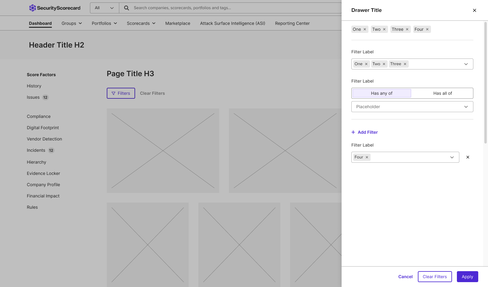
Scope
Can impact an entire page or a single page element (e.g. a dashboard or full-page table)
Scale
There is a large set of data points that may need to scale based on user choice
Layout
The filtered elements or page content are the primary area of focus, not the filters themselves
Behavior
The user is trying to narrow down a specific data point to complete a task
Guidelines for Filter Drawers
Don't
Give filter options in the Drawer that will give no results when applied. Because the drawer is a batch-filter, the user will only realize after the drawer has closed.
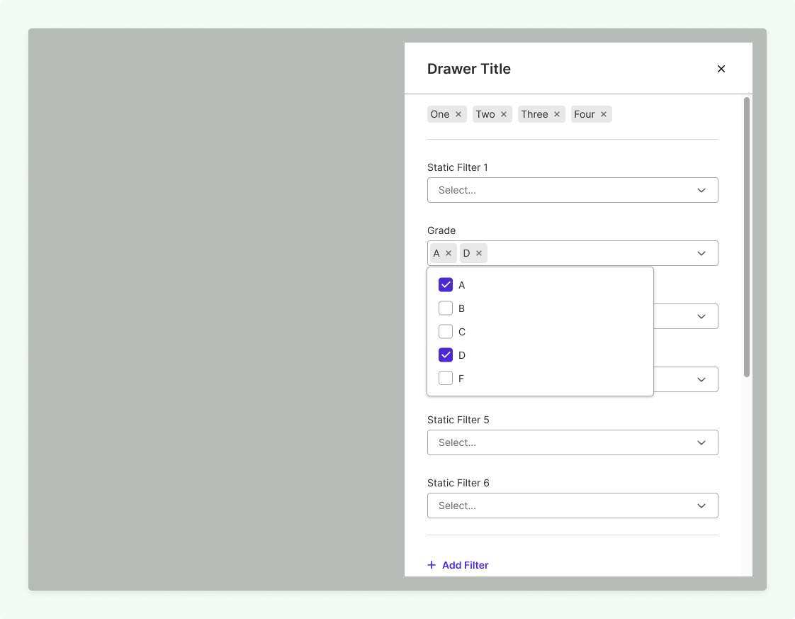
Do
Give options that mirror the available data being filtered, so the user always gets a result after the filter has been applied.
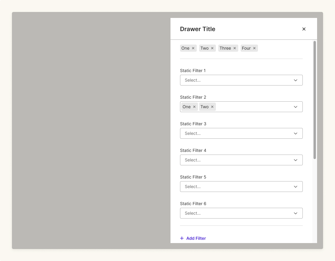
Avoid
Giving more than four static filter options, as different users will likely have different needs here. Dynamic filters allow users to choose the data points that are relevant to them without too many data points by default.
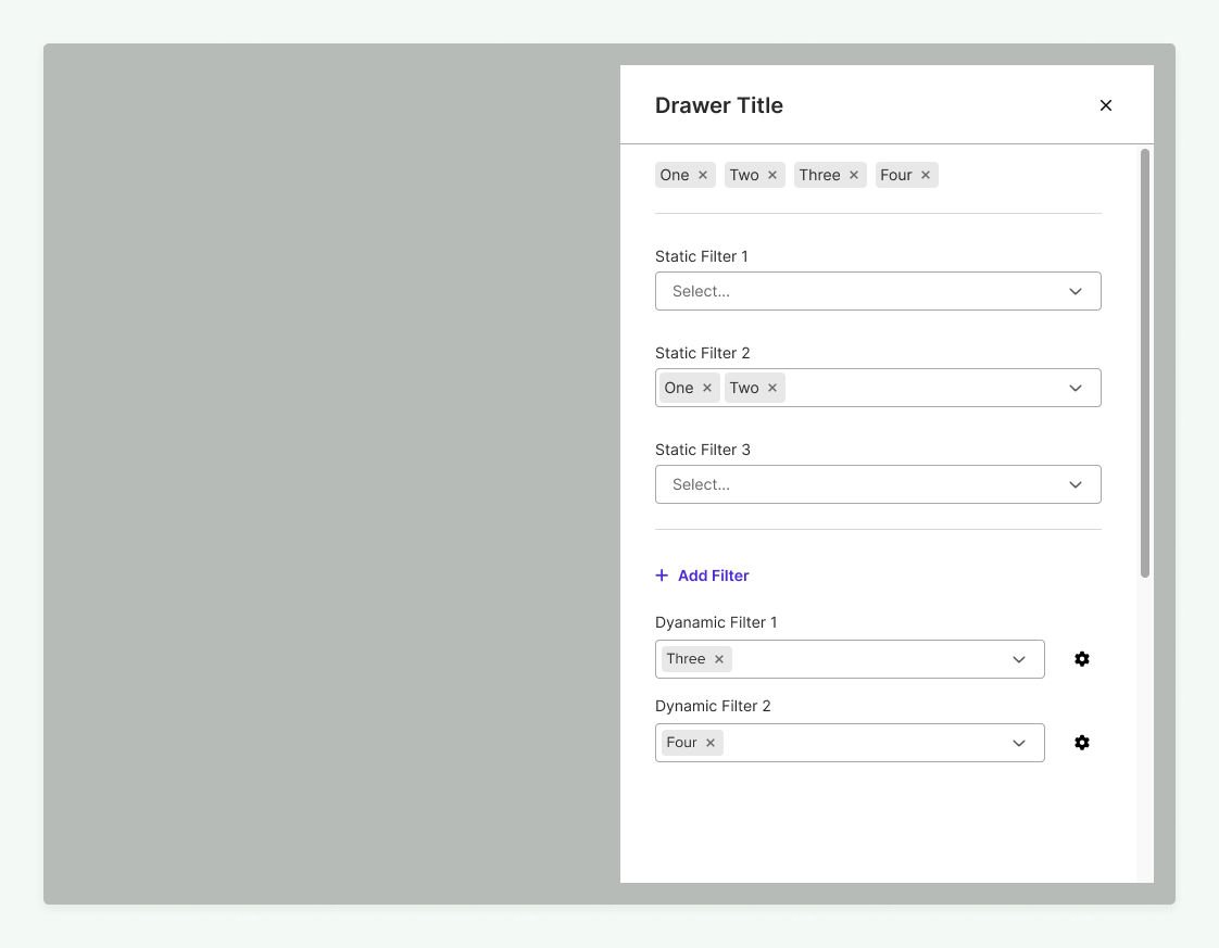
Do
Use analytics and research to determine the 3-4 most commonly used filters categories, and place those as static persistent options in the drawer
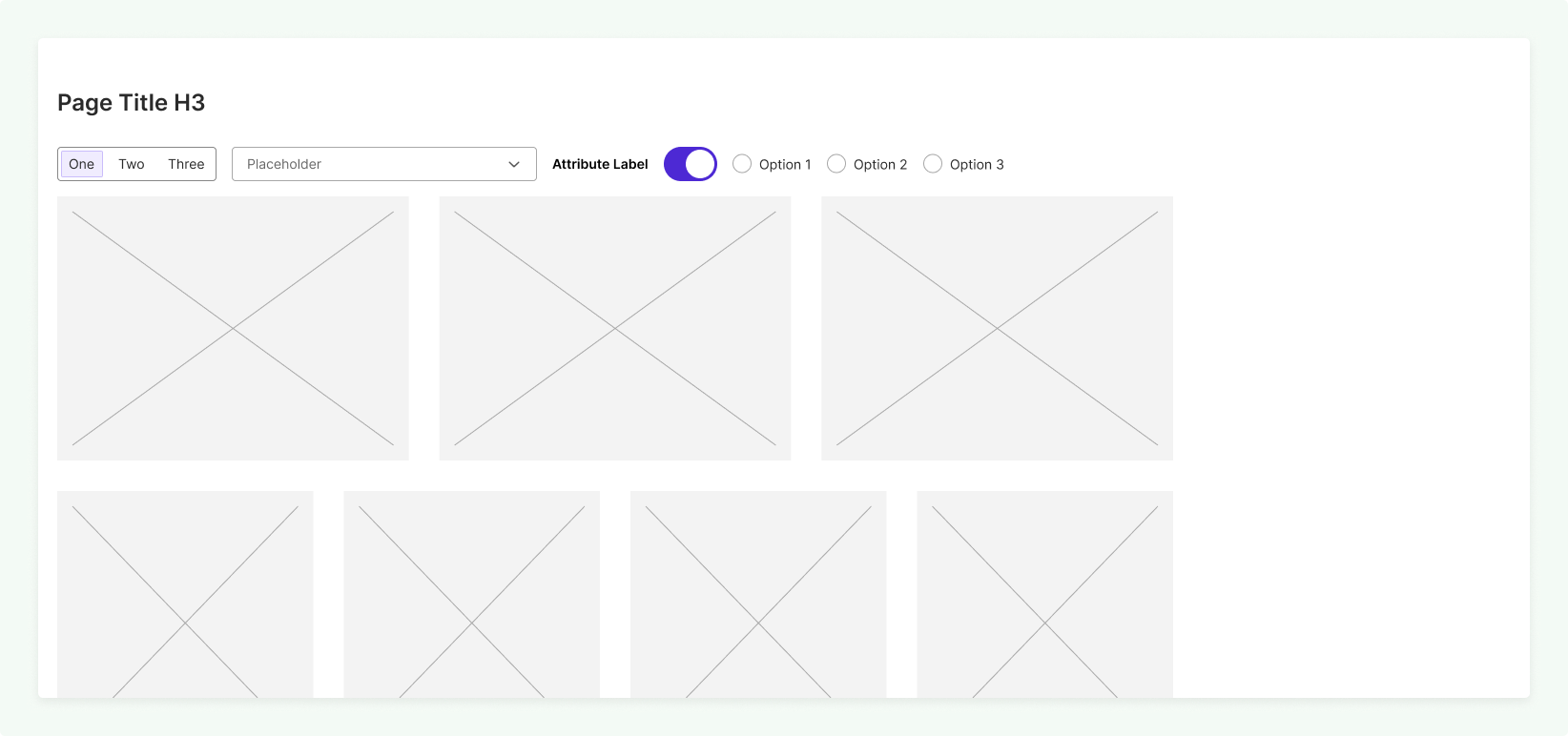
Pattern #4: Vertical Sidebar
Scope
Can impact an entire page or a single page element (e.g. a dashboard or full-page table)
Scale
There is a large set of data points that may need to scale based on user choice
Layout
The filter controls and filtered page elements are equally important in terms of page layout
Behavior
The user is exploring differences between data points and facets
Guidelines for Vertical Sidebar Filters
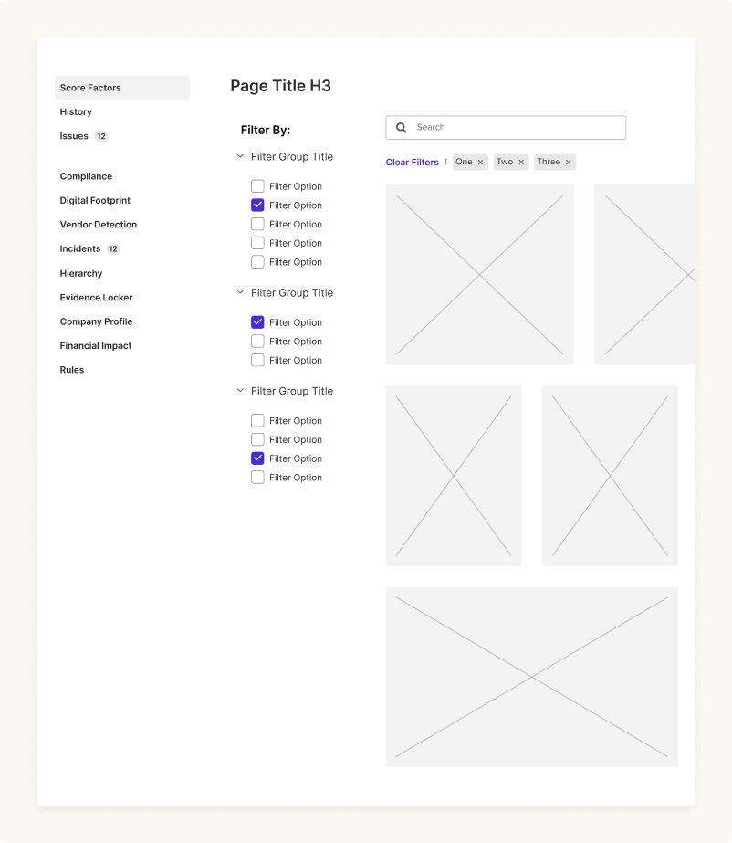
Avoid
Using this pattern when the page has vertical navigation, as this creates a potentially confusing page layout for the user.
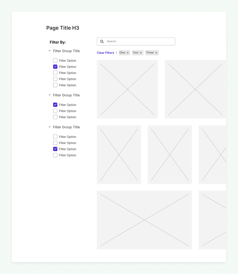
Do
Use this pattern on simpler pages that don’t have a vertical navigation sidebar.
Nice Patterns! ...so now what do I do with them?
Audit and clean up outliers
Use these patterns as a reference to go screen-by-screen and make notes of where your product does or does not follow these patterns. Once you have your list, add tasks to your work tracking system of choice and write user stories to explain the benefits of design consistency in you product.
Publish and socialize across your teams
Now that you have patterns to follow, it's time to spread the word to all members of your design team and beyond! Share these patterns in team meetings or department presentations so everyone is aware the next time they need to design a filter interaction. It's an especially good idea if you have a published design system site to post them there as well.
Create reusable design assets for your team members
Design platforms like Figma and Sketch make it easy to create reusable design asset component libraries, so investing some time to create one can make it fast and easy to create new designs in future.